


Charts + Pictures = Eye-Catching Information! Create and Learn
- Create and Learn

- Jul 29, 2018
- 3 min read
Updated: Aug 16, 2018
Studies have found that 90% of the information that we remember is based on visual impact. Try this step by step and learn how to use charts and pictures to create great eye-catching information.

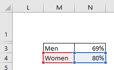
1- Type the information words and numbers below in Range M3:N4.

2- Type CUSTOMER SATISFACTION in cell A1.

3- Select Range A3:K20. Go to "Home" tab, "Font" group, "Fill Color" and select Gray 25%.

4- Go to "Insert" tab, "Illustrations" group, click on "Shapes" and select "Oval". Click and drag to create a circle.

5- Go to "Format" tab, "Size" group and set the "Height" and "Width" to 8cm.

6- Go to "Format" tab, "Shape Outline" and select "No outline".

7- Copy and paste the shape and drag as figure below.

8- Select Range M3:N3. Go to "Insert" tab, "Charts" group, "Insert Column Bar" and select clustered column.

9- Right click the vertical Axis and select "Format Axis".

10- Go to "Axis Options", "Maximum" and type 1.0. "Minimum" and Type 0.0.

11- Delete the Axis, Titles, Legend and Gridlines.

12- You can press "Delete" key or use the "Chart Elements" box.

13- With the chart selected format "No Outline" and "No Fill",


14- Go to "Page Layout"' tab, "Sheet Options" and deselect Grid lines View.

15- Double click the Series "Men", right click and select "Format Data Point".

16- Go to "Series Options", "Gap Width" and type 0%.

17- Go to "Format" tab, "Size" group and set "Height" 6.5cm and "Width" 2.5cm

18- Go to "Shape Fill" and select "Gold, Accent 4" color.

19- Copy the chart, select cell G4 and paste.
20- Click and drag the charts.

21- Select right Chart, and change the data to Range M4:N4.
22- Double click the chart on Series "Woman". Go to "Shape Fill" and "More Fill Colors". Select as figure below.


23- Your spreadsheet should be like this:

24- Remember that you can select the shapes or charts and Bring Forward or Send Backward by using the option below.

25- Save the image below (Man and Woman) by right clicking the image and select "Save image as" ; or download the Excel file in the end of this article.


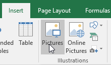
26- Go to "Insert" tab, "Illustrations" group, click in "Picture" and choose the images that you just saved.
27- Change their Heights to 6.25cm.

28- Click and drag the images over the charts. Change the values to 69% and 80%.

29- Go to "Insert" tab, "Text" group and click on "Text Box".

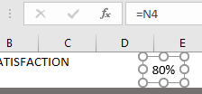
30- Click and drag to draw a Text Box. With the text box selected type in Formula Bar =N3 to link the N3 value into the text box.

31- Create one more text box. Click and drag to draw a Text Box. With the text box selected type in Formula Bar =N4 to link the N4 value into the text box.
32- Configure each text box as image below. "Forte Font", "Size 28", and colors. Click and drag them.


33-Select Range A1:K1. Go to "Home" tab, "Alignment" group and select "Merge & Center".

34- Configure the Range as image below. "Eras Bold Font", "Size 26", "Font Color White", " Fill Color, Gray -25%, Darker 75%", "Bottom Align" and "Center".

35- Change Row1 height to 45.00.

36- Change Row2 height to 3.00.

37- Change Row 21 height to 3.

38- Select Range A22:K22 and change color.

39- Change Row 22 height to 7.50.

40- Congratulations! You have used Chart and Pictures to create a Eye-Catching Information.

Extra Help: How to Set Transparent Color:
If you want to learn more about using shapes and pictures to create visual content, try my book "Dynamic Infographic":

If you like the post, please share by clicking on buttons below.


Comments