


Dashboard Resume - Part 1
- Create and Learn

- Sep 6, 2018
- 6 min read
Updated: Aug 26, 2019
Having the most important information available, focused on your audience, and telling a good story is essential for any great presentation. Also, it helps people understand the data and make better decisions.
In this article, I will show you how to create an easy and fun "Dashboard Resume" in Excel, and the knowledge acquired can be applied to other dashboards.
You will create the dashboard template and links. Why not use your own data later :)
Lets have some #DashboardFun

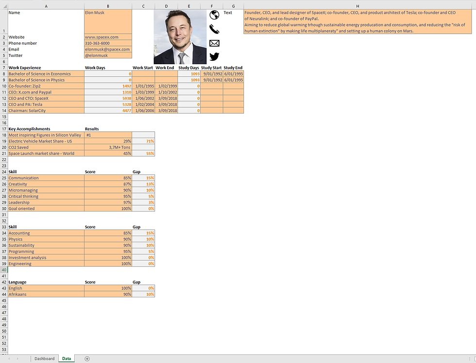
As you can see to create this nice Dashboard Resume, I did some quick research on Elon Musk (if you don't know him, his resume should tell a lot), using information from Novoresume, Wikipedia, and some personal assumptions; for instance, I tried to guess his level of English and Afrikaans :)
*** Before we start, I have few comments on Warm-up, Download File, and Colors.
Warm-up
If you are beginning your journey in the exciting world of Dashboard Creation, and have none or little experience with excel, I invite you to do some warm-up exercises to give you the basics.
Here are two nice and useful warm-ups that will help you to start your Dashboard journey:
Article a:Create beautiful Infographics in Excel
But, if you already have experience creating charts, and know the basics of Excel, go ahead; you should be fine.
Download File
The downloadable file available has three tabs: the first tab called "Dashboard" is the place that you will create your Dashboard Resume, the second tab calls "Model", and it has the complete template; third and last is called "Data" has the main data you will be using.
Click on the link below, sign up, and download the file.
Colors
This dashboard is using six different colors and the "no fill", or transparent.
Below you will find the color guide and their RGB codes (Red, Green, and Blue).

1- To set the proper RGB codes you just need to go to "More Colors".

2- When the window "Colors" opens, go to the "Custom" tab, and change the numbers according to the Color Guide above. The example below is showing how to set the "Series Red" - RGB: 250,81,62.

Dashboard Resume - Part 1
1- If you are not using the downloadable file, and you want to start from scratch, Double-click the first tab and rename it "Dashboard"; add a new tab and rename it "Data".

2- Download the file to copy the data that we will use. If you want to save time, we can use my file that already has the tabs, data, and the Dashboard model.
3- Go to Page Layout tab, Sheet Options and deselect Gridlines View.

4- Select the range "A2:X53", and change the color. Use the "Main Background - RGB: 255,255,255" listed in the top of this article.

5- Go to "Format Cells", "Border". Pick the "Border Color RGB: 191,191,191" and select "Outline" then press OK.

6- Select the Range "E4:Q12" and change the color to "Section Color RGB: 230,230,230".

7- Do the same in the range "S4:W12.

8- Change the width of "Column D" to "3,00" or "26 pixels". Do the same to "column R" and "Column X".

9- Copy and paste the profile image, and contact icons, available in the "Data tab".

10- Select range "E4:Q5". Go to the "Home" tab and select "Merge & Center". Do the same for the range "E6:Q12", and marge this range.

11- Link the data available in the "Data tab" by typing "=Data!H1". The summary data should be linked.

12- Change the summary text format to: "Text Size 14", Color "Body Text - RGB: 38,38,38". Go to Alignment and click on "Increase Indent".


13- Change the profile name: "Text size 24", title color "Title - RGB: 46,67,84", and click on "Increase Indent".

14- Insert a "text box".

Change its background color to "No Fill".

Then, select border and type the formula "=Data!B2".

15- Change the text: "Text Size 14", "Body Text - RGB: 38,38,38", .

16- Hold "Ctrl key" and select the icon, and the text box. With both selected, go to "Format tab", and click on "Align Middle".

17- Create three new "text boxes", and do the same, linking the phone, email, and twitter.

18- Go to "Data tab" and select the range "A7:C14".
19- Go to "Insert" tab, "Charts" group and select "Stacked Bar".

20- With the new chart selected go to "Design" tab and select "Select Data".

21- Click on "Add"and include a new "Series values" as image below.

22- Include the "Series name" as well and click OK.

23- Do the same for "Study Start".

24- Change the order of each series by using the "Move" button. Your series should look as image below.

25- Right click an individual series and click on "Format Data Series".

26- Change the series colors. "Work Start" with "No fill" || "Work Days" Blue - RGB: 46,67,84 || "Study Start" with "No fill" || "Study Days" Red - RGB: 250,81,62.

27- The result should be as image below.

28- Click on vertical axis, and go to "Format Axis". Go to "Axis Options" and select "Categories in reverse order".
*** To move the horizontal axis, double click the horizontal axis, go to "Labels", and select "Label Position" as "High".

29- Select the chart area and go to "Format Chart Area". Change the "Height" and "Width" as below and select "Don't move or size with cells".

30- Go to Format Axis and change the Fill and Line.

31- With the chart selected, go to "Chart Elements", and let only the "Axes" option on.

32- Click on any series and go to "Format Data Series". Change the "Gap Width" to 338%.

33- Double click the "Vertical Axis" and change the size to 14, and text color "Body Text - RGB: 38,38,38".

34- Double click the "Horizontal Axis" and change the size to 12, and text color to "Body Text - RGB: 38,38,38".

35- Select the Chart and change the "Shape Outline" to "No Outline".

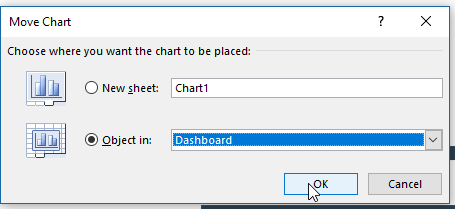
36- Right click the chart and click on "Move Chart".


37- Select the "Dashboard" tab option and click OK.
38- The chart should move to the "Dashboard" tab. Select the chart and change the background color to "No Fill".

39- Change "Column Q" width to 14.86, or 109 pixels.

40- Go to "Insert" tab, and clicl on "Text Box". The new text box should have the configuration as below (Shape Outline, and Size).

41- Type "Work Experience and Key Accomplishments", and change the background to "No Fill".

42- Create 6 (six) new "Text Box", and link them to its related data in "Data Tab" (check item 14 in this article if you have questions).

43- Here is the table that you will be linking. You can also check the original file for extra help.

44- Insert a new text box (as item 40) , and type "Skills and Competences".

45- Change the "Shape Fill", "Shape Outine", and "Size".

46- Move the text boxes to have a similar result as image below.

47- Go to "Data Tab" and select range "A24:C30".

48- Go to "Insert" tab, "Charts" group and select "Stacked Bar".

49- Select the chart, go to "Chart Elements" and let only the "Primary Vertical Axes" checked.


50- With the chart selected, go to "Format Chart Area", and set "No Fill" and "No line".

51- Change the text size (14), and colors as below. "Blue RGB: 46,67,84", and "Gap 191,191,191".

52- Right click the chart area and click on "Move Chart", then "Dashboard".

53- Change the "Height" and "Width" as image below.

54- Follow the steps 47-53, and create the two other charts. Then select them and align using "Distribute Horizontally".

55- Move the objects to have a result similar as image below.

56- Go to "Data Tab", select range "A19:C19", and insert a "Doughnut Chart".

57- Right click the series, and format the border as "No line".

58- Double click the data points and change their colors as below. "Red RGB: 250,81,62", and "Gap 191,191,191".

59- Format the "Chart Area" as "No fill" and "No line".

60- Go to "Series Options" and set the "Angle of the first slice" as 180; and "Hole Size" as 85%.

61- Go to "Chart Elements, and uncheck all options.

62- Change the size as image below.

63- Create the second doughnut, following steps (56-62).
Insert a new "Text box". Create the link with the specific value and align chart and text box (if you have questions, go to step 14).

64- Congratulations! You have created a professional and eye-catching Dashboard. Now, [ after share this article with your friends :) ] you can try to use your own data or change the topic.

If you want to practice more and learn more. Try my book available at Amazon:

Remember to follow us!


Comments